Sensi-Tummy
Sensi-Tummy
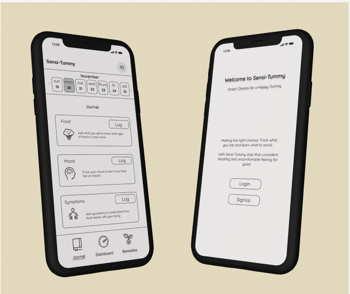
Our team was tasked with creating a practical app. We created and designed, Sensi-Tummy, an app for users with stomach issues to be able to track their symptoms, meals, moods and find remedies in order for them to make healthier, more informed choices.
We started by creating a proto-persona in order to get a better idea of our targeted demographic. We hypothesized that our users would have stomach issues and need help assuaging their pain and discomfort.
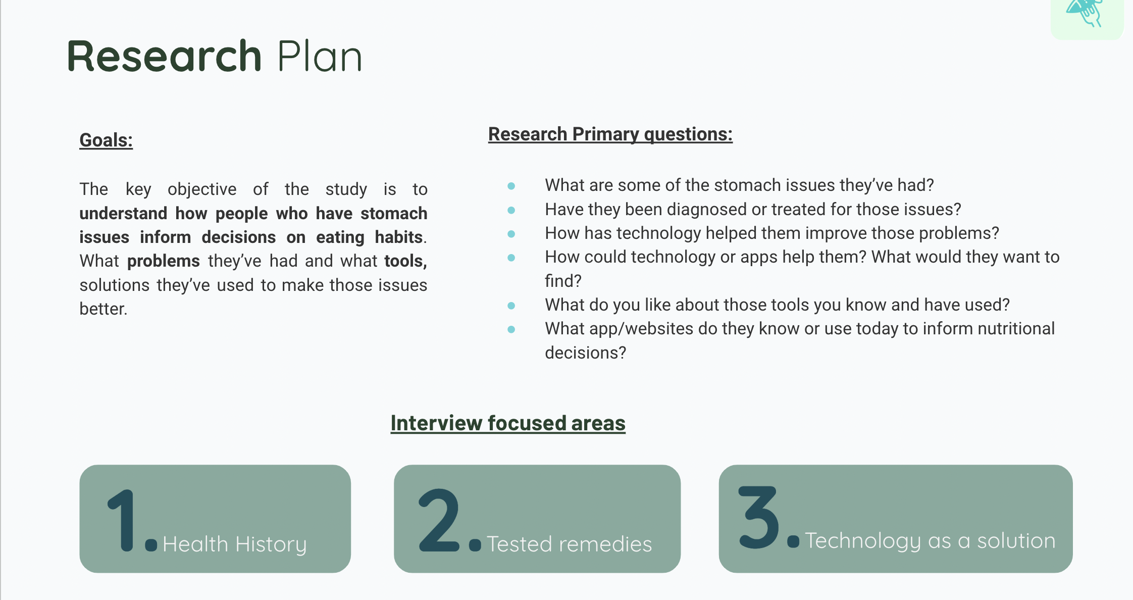
We, then, developed a comprehensive research plan for our research approach. This was for our user interviews. We wanted to focus on health history, tested remedies and technology as a solution.
We conducted user interviews and this is some of what was said.
“I have a pretty complicated relationship with food”
“I take probiotics and a daily GI pill.
“I’m gluten free and vegan to feel better”
“Sometimes I feel like I’m missing out because my eating regiment is so restrictive”
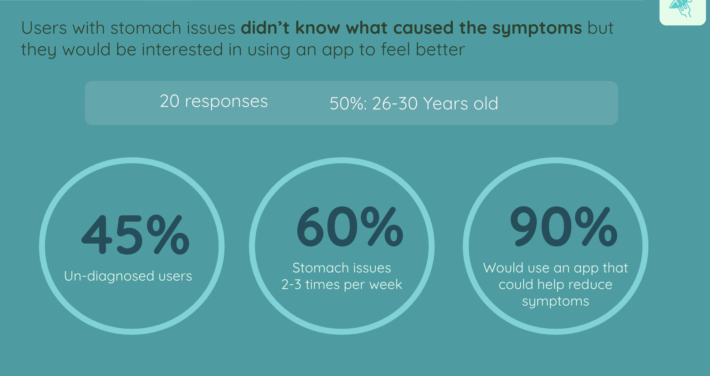
We conducted a survey and found out these results…
68% of users didn’t track what they ate.
80% would remove foods as a remedy
85% would be willing to track what they eat to feel better
Hypothesis Statement
People with stomach issues could benefit from an app that helps them make informed healthy choices and ultimately, make them feel better
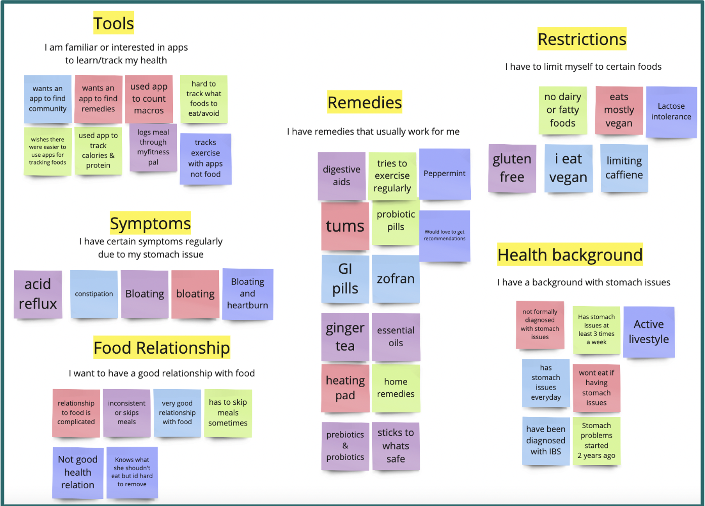
Affinity Diagram
Key Takeaways:
The main symptoms are bloating
Users have tried multiple remedies
Users have difficult relationships with food
Users remove foods from diet
Users are interested in apps to learn about their health
Problem Statement
We believe we can help users with stomach issues live more consistently comfortable and pain-free lives by providing an app to make informed nutritional decisions.

User Insight
Our user needs help making informed eating decisions but not remembering what she ate doesn't help know what causes their stomach issues, and we’ve found that tracking food can lead to finding the root cause of the problem.
However, logging food is a tedious task that may not have a perceived, big impact and thus, users don’t normally keep up with it.
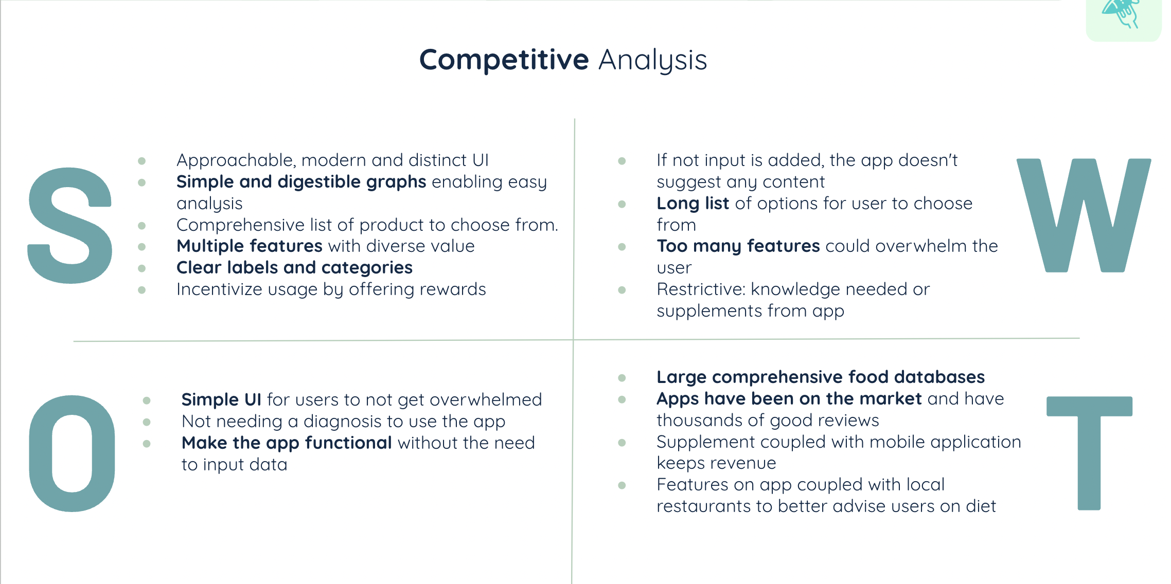
Competitor Analysis
We conducted a competitor analysis and found that there are a lot of great, effective apps out there for users with stomach issues. Something we found interesting is that most of the UX in these other apps was confusing and not super easy to navigate.
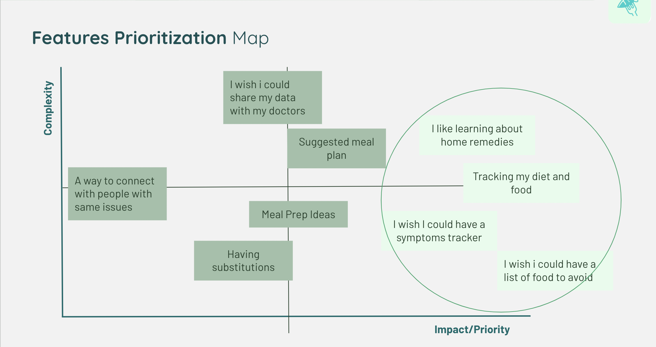
We created a feature prioritization map based on our “I like…I wish…what if” diagram. The highest on impact and priority were learning about home remedies, tracking food, diet, and symptoms and knowing which foods to avoid so, we tried to incorporate all of this into our app.
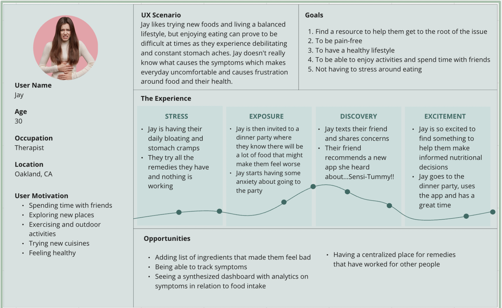
User Journey Map
We created a user journey map to get an idea of a UX scenario in which a user would use our app.
User Flow
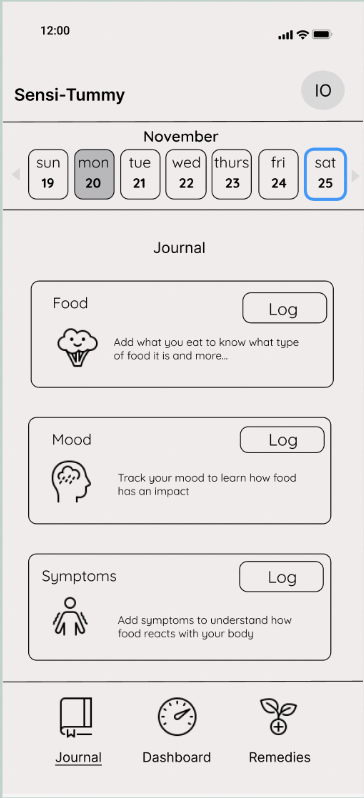
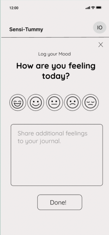
We created a full user flow for our app and decided to focus solely on the tracking of symptoms, moods and food for the sake of our usability testing
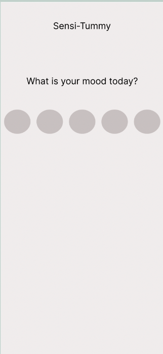
Lo-Fidelity Wireframes
Mid-Fidelity Wireframes
With this app, we only designed up to mid-fidelity. Perhaps in the future, we could do high-fidelity
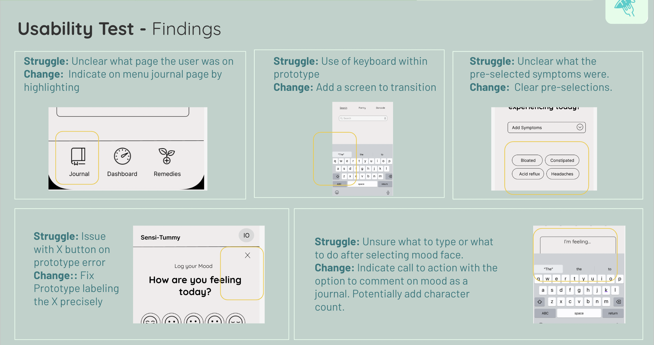
Usability testing
After we prototyped our mid-fi wireframes, we conducted usability tests. People found that the design was really seamless but could use some help nonetheless. So, we iterated our design to fit the needs of the users.

